 Carved Monterey Pine II - 10 in. x 8 in. Carved Monterey Pine II - 10 in. x 8 in. In my last blog post, I mentioned a commission that I was working on for a patron from Switzerland. I am pleased to say that I finished it, and then mailed it via the US Postal Service.
There is always a moment of trepidation when I ship my paintings. Even though I pack them very carefully, I worry that careless handling or some other disaster may befall them. However, the package arrived in only a few days, to our mutual delight. My patron emailed me that "These will bring some more color in my office, and a piece of California's nature as well." Kind words indeed, and it is very gratifying to have four of my carved paintings, one of which you see here, gracing a wall in Zurich.
0 Comments
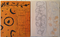 Finished carving; work in progress. Finished carving; work in progress. I am currently working on a commission for a patron from Switzerland, who saw my carved paintings on display at Washington Square Park here in SF. He went to my website afterwards, and liked the quartet of images that I called "The Four Seasons." That series was also a commission, where the images were selected from other images on my site. In both instances, I took the original pieces and made new drawings for each section of the carvings, so that each piece is unique. The image featured in this post shows a finished piece on the left, and a piece that is partially carved on the right. Each piece is 10 in. x 8 in. Only two more pieces to go - perfect for the holidays!
Many people have asked me about my technique for doing my carved images. I tell them that almost every aspect of the carving is done using hand tools, generally a 1/16 in. V-gouge and a 1/4 in. flat chisel. This is enormously time consuming, but results in a look and feel that cannot be achieved using power tools. This is especially the case with the carvings that I do of the flowers and plants that are featured in these works. I begin by doing a careful line drawing of the plant. Often I do the drawing on tracing paper, although occasionally I use Strathmore 70 lb. drawing paper. I transfer the drawing to the wood - usually 1/8 in. birch plywood - using Saral carbon paper. I then set about carving the outline using the V-gouge. Once the outline is finished, I go over it with the sharp corner of the flat chisel. I then use the chisel to remove the first layer of wood, and to carve into it as desired. I sharpen these tools every 20 minutes or so using a soft pine shaper and a leather strop. Because I do this so frequently, I very rarely use a sharpening stone, although I have two excellent Japanese stones for this purpose. Once the carving is finished, I go back over it very carefully to bring out the details. 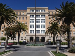 Yesterday I worked with my friend and colleague Beverly Mikolon to hang a show of 11 of my large abstract paintings at the Presidio Landmark Apartments. They are located in the lobby of what was once the old Public Health Hospital at 14th Ave. and Lake Street, just inside the border to the Presidio. That hospital has been utterly renovated, and the formerly functional but dreary lobby has been transformed into the entrance to a building now composed of luxury apartments. The location is superb, the views are unusual, and the artwork looks great there. Please stop by take a look - the address is 1801 Wedemeyer Street here in San Francisco. The show will be up until October 20th. Check in at the front desk, and let them know that you are there to look at the art. Between the art and the views looking south at the City, it is worth a visit!
While browsing Google for postings about myself, I came across another Bob Armstrong, who just won an award in England as a master craftsman. That Bob is a "Thatcher" by trade, making and repairing reed roofs in a style that would be familiar to builders there a hundred years ago. Apparently, he is from the Downton area, known to viewers of the eponymous BBC show about that region. He was given the David Stewart Lifetime Achievement award winner at The Balvenie (Scotch Whiskey) Masters of Craft 2012, an awards programme which recognises, honours and celebrates highly-skilled craftsmen and women around the UK.
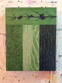
“Bob Armstrong has established a reputation over a wide area of the south of England for quality workmanship on all types of thatched roofs that is second to none and he thoroughly deserves this award. He works with wheat reed and water reed and occasionally long straw, which has largely died out in this part of the country. " The article about this from the Salisbury Journal can be found at the follwing link: http://www.salisburyjournal.co.uk/news/ruralfocus/9853744.print/ It is a privilege to share his name! This afternoon my good friend Mary DeLave and I hung 13 of my paintings at the SF Bar Association at 301 Battery St. The venue is a large conference hall where lawyers attend lectures and classes offered by the continuing education division of the Bar. The paintings really enliven the space, which is well lit but otherwise sterile. They are predominantly abstracts, and feature my signature use of vivid colors and texture. One grouping of orange paintings, called Clown Quartet, is very bright indeed. These paintings are displayed near the speaker's podium, and Mary remarked that their hue is so bright that the audience will hardly notice the speaker! I, on the other hand, felt that they had more to fear from the after-image upon viewing the paintings, not unlike sunspots. Mary is a gifted artist who shows with me in outdoor exhibits sponsored by the Artists Guild of San Francisco (http://www.artistsguildsf.com/) Her work can be found at her website: http://www.marydelave.com/. We joined the Guild at around the same time, and she has been a consistent fan of my work, as I am of hers. I can attest that she is a very patient person, but also very expedient in hanging a show. I tend to obsess over the details of how a painting looks in a space, while Mary counterbalances this tendency. She trusts her instincts about how to hang a painting, and does not let niggling details intrude. This involves both trust and confidence, which are important qualities for artists. Well done, Mary! Thanks! 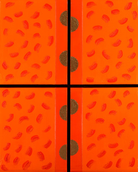 Clown Quartet - 48" x 60" - Acrylic and Mixed Media (c) 2009 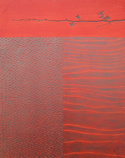 Carved Red Quince - 20" x 16" - Mixed Media I bought some Quince branches earlier in the year, around February, and found them very charming and evocative. The nature of the line that these branches create- slightly angular and almost hesitating in their direction- reminds me of the sort of line quality found in certain Asian ink drawings. In addition, I find Quince blooms to be exceptionally pretty.
The paintings in this series divide the picture plane. I chose to divide this painting into three sections in order to offer a poetic narrative about nature. The carved Quince branch at the top is the tree in bloom, a metaphor for hope and fresh starts, offering beauty to the world. The left section as we face the painting is also carved, and while I intended it to represent the bark of a tree, it also can be seen as a flow of water or as a cross section of the tree at a cellular level. The right section illustrates the grain of the wood panel, but also functions symbolically as a wave pattern, whether in water or soil or sand. In a way, this painting, and others in this series, represent a celebration of the wood panels that they are carved on. Formerly, I had used these panels as a substrate for other paintings. I noticed, however, that the panels themselves were quite lovely, and this led to the idea of this series. Over 15 years ago I had done relief printmaking, first carving and then printing wood and linoleum blocks. The carving tools were still in my possession, and this made it easy to begin this investigation of these panels. Finally, I must note the influence of Asian art on this series, particularly that of Japanese painters. San Francisco has always had a strong Japanese presence, and is blessed by a wonderful Asian Art Museum. While I have studied widely in many areas of art history, I have always admired the use of negative space in Japanese paintings. I am also moved by the surprising way that objects enter the picture plane, in a way that is both sensitive and dramatic. These qualities are found in this painting and in this series. 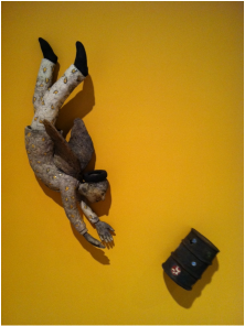 Stephen Braun/Guardian Angel for Oil/Raku Last week I had the pleasure of visiting the Missoula Art Museum, in Missoula, Montana (http://www.missoulaartmuseum.org/.) They currently have a fine exhibition of contemporary ceramic art from that lovely state, in a show called "Home, Home on the Range. " Featured are 19 artists who collectively exemplify "the essential cultural fiber of Montana." Two artists in particular have pieces that I found of interest. Stephen Braun has a piece called "Guardian Angel for Oil," made with Rakued Clay, showing a diving angel who is apparently about to save a barrel of oil. I enjoyed the metaphor, especially given our oil dependence and the current price of gas. I was most impressed, however, with his technical skill and the way he handled his materials, specifically the way he used the Raku texture to enliven the angel. Here is a YouTube video that features him at a raku clay workshop: http://www.youtube.com/watch?v=VU6ST-YQC_8 . The second artist whose work I enjoyed is Adrian Arleo. Her piece is a life- sized female figure called "Eve Honeycomb", and is made with clay, glaze and wax encaustic. I felt moved by her concern for the natural world and the primal part that bees play in our environment. I also felt kinship with her work, since my Bee series addresses the same essential ideas, and also uses hexagonal marks to illustrate honeycombs in beehives. Here is link to a workshop that she will offer in October at the Archie Bray Foundation: http://www.archiebray.org/workshops_classes/workshops_2011/workshop_arleo_2011.html As is the case with my paintings, these pieces invoke the sense of touch as well as the sense of sight. I have never done ceramics, but its tactile qualities are seductive, and I admire the beautiful effects. 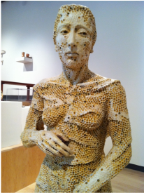 Adrian Arleo - Eve Honeycomb - Clay, Glaze and Wax Encaustic Yesterday I hung a show at Scheidenhelm Architecture at 732 Chenery Street #A in SF (http://sf-arc.com/page.php?id=10). Carl Scheidenhelm is the owner, and he is friends with Tachina Rudman, who is my friend from her work with the Open Studios organization ArtSpan and their Art for City Youth program. (http://www.artspan.org/). Tachina is the mastermind behind the art shows at Carl's, and does a great job featuring exciting work there by local artists such as myself. The show took about 3 hours to hang, which might seem long for a show that has 15 paintings. Because this is a working architect's office, however, it is necessary to work around existing furniture and office equipment. In the short run, this can seem like a hindrance. However, under Tachina's direction, and with my wife Kate's help, we were able to display the work seamlessly in the space. The office is enlivened, the work is showcased, and it looks great. For this exhibit, I am showing work that has a strong design emphasis. I use strong primary colors, and much of the work is very linear and geometric. Because of this, it fits very nicely in an architectural office, where it has qualities that it shares with architecture. We are now planning to have an opening on Wednesday, September 7th, at 6pm. I will post specific details later, but feel free to stop by the office storefront, gaze at the art in the windows, and perhaps knock on the door to see if you can take a quick tour. The exhibit will be up about 7 weeks, and will come down after the second week of September. 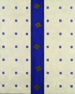 This painting, Peacock Blue, is in the left window of the office. It is 50" x 40", and is mixed media on canvas. 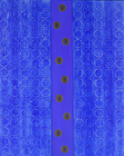 This painting, Blue de Nimes, is in the right window. It is 50" x 40", and is mixed media on canvas.  Pablo Picasso, "Portrait of Dora Maar", 1937 Last week I went with friends to the Picasso exhibit at the deYoung museum in Golden Gate Park in SF. Scores of his paintings, prints and sculpture are on view there, part of a traveling show from the collection of of the Musee Picasso in Paris.
It is truly a gift from that museum, and the French Ministry of Culture, that these pieces are allowed to travel. I have never had the pleasure of visiting that museum; indeed, I have spent only 8 hours in Paris, and that was many years ago. So, viewing these works in my own town is a rare artistic and educational opportunity. That said, I have never been a great fan of Picasso's paintings. He is wonderfully confident, creative and unafraid, but at times too self indulgent, and almost sloppy, in the execution of his ideas. In addition, he remains for me only a mediocre colorist, with occasional notable exceptions. (I have always been partial to Matisse, whose love of color and whose protean ability to reinvent himself and to invent new styles of painting makes him for me the defining talent of the 20th century.) Despite these criticisms, I have never seen a bad Picasso drawing or print. He is perhaps the best draftsman of the last century. His sculpture is both astonishing and prescient in its creation of the major trends which followed it. And, his ceramic works are as free and lovely as his drawings. My niggling should not discourage a visit to this exhibition, which showcases a talent that is inspiring in its creative range and technical excellence. You should go and take a look- it will be well worth your time. Here are some pieces that I particularly enjoyed:
|
Bob ArmstrongI am a San Francisco artist who enjoys making art and visiting art exhibits. Archives
January 2017
|
 RSS Feed